

I always assume things will be better in the future. Not just different, but actively better. Of course, living through the last decade or so has done its level best to try to push me away from this worldview. But mostly all that time has done is remind me that the assumption I’ve made is not a guarantee, and is instead something that needs to be actively pursued to be achieved.
And while I’ve always disagreed with them, I understand why for some people the past feels like a better place. It’s because it’s safer, and usually brings us back to a time when, even if things were actually terrible, you noticed the terribleness less for one reason or another. Which is something that is especially true for sports, and in particular, what they used to look like. Both in terms of the play on the field and, more importantly for this discussion, what the jerseys and logos used to look like.
Now, of course, not all logos are better now than they used to be. And there is definitely something to be said of the 1970s-early 90s aesthetic that created an entire generation of logos that weren’t thought so much as a way to sell merchandise, but to make the team memorable, fun and kid/family-friendly, as opposed to, well, this:

But there’s almost no world in which the design from the period immediately after this — from the late 90s through the 2010s — is worth going back to, especially when it comes to graphic design (as who am I to tell you an atomic purple Gameboy isn’t dope?). The reason I believe that, and basically always have (even while it was happening) was made abundantly clear to me over the last week, when this showed up in my instagram feed:
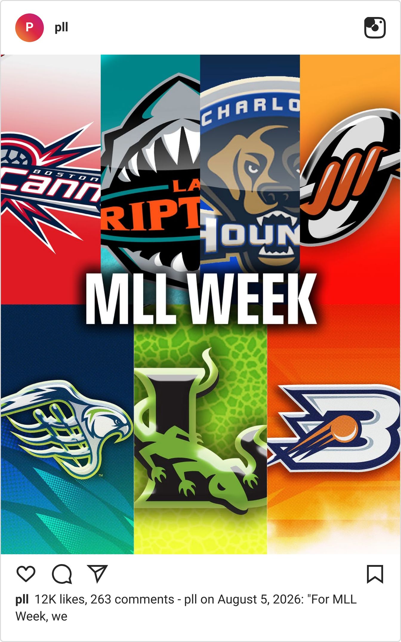
As you may be able to tell by the initial image, the Premier Lacrosse League has attempted1 to bring back the logos and branding of teams that were either lost when Major League Lacrosse (the MLL, their immediate predecessor) was folded into the PLL or by providing “retro” (read: uglier and lower-res) versions of the logos for the two MLL teams (the Boston Cannons and Denver Outlaws) whose branding matriculated its way to the PLL when hometowns for the teams were announced a few years ago.
And I truly cannot express to you how misguided this kind of nostalgia is, almost grotesque in its existence. Nostalgia is, to me, a terrible idea in general, and one which still should be considered a mental disorder the way it was when it was first identified by medical professionals.It’s wanting to bring back not just this kind of aesthetic, but the literal/actual failure with which it is directly associated that is exactly the kind of thing that makes me wonder why exactly people yearn for the past. Is it because they actual want it to be like it once was, or because they have such a fear of the unknown that is possessed by the future?
There’s really nothing good about the logos, or the team names, and while I know Brad disagrees with that, he is not here to push back2 on anything I say until at least next week. There are nonsense team names like the Bayhawks — with their truly insane logo, which is, supposedly, attempting to combine an osprey3 with the netting of a lacrosse stick, but mostly ends up looking like someone decapitated a bird and placed its head in the shouty end of a French horn — and the Long Island Lizards4, which sounds less like a proper name for a lacrosse team and more like one used for the “street”/”guerrilla” marketing team at an alcoholic energy drink company.
These stand right alongside teams like the “LA Riptide” and the “Charlotte Hounds”, brands which look and feel like one of the random teams on a “behind the scenes of a sports franchise” TV show that doesn’t have a working relationship with a professional sports league. Like rooting for the Los Angeles Waves on “Running Point,” but without the charm of getting to watch Kate Hudson do screwball comedy .
I don’t think any of this is evil5, just kind of lame. And while I personally find its existence depressing, this kind of nostalgia blitz is very clearly being done by the league to hook in lapsed fans of their predecessor (which is probably why reading the comments on the above post were such a stark reminder of why I spend so much time alone) and sell new merch to already-existing customers who want a different way to identify themselves with their favorite lacrosse team6.
What does actually bother me, though, is the ways in which this kind of promotion undercuts another themed overhaul of the league’s aesthetic that happened just a few weeks ago. When the PLL celebrated — as a continuation of a tradition for the league over the past few years — the long and storied history of Native American involvement in the origins and continued evolution of lacrosse with their Indigenous Heritage weekend.

Instead of mining a much grosser, less interesting (and very recent) past, these reimagined ideas of what the teams are, who they represent and how they should look. With the designs, as opposed to the lukewarm microwaves ones they are coming out with for this weekend, the league managed to look both farther back and further into the future to create shit that actually seems cool. And, maybe more importantly specifically because I am not the target audience, something I’d be willing to be caught dead wearing (even the Atlas stuff, which is usually terrible looking on top of making no gd sense as a name for a team from New York).
And, for once, this isn’t our (okay, mostly my7) usual leftist politics shining through, but a genuine preference for reimagining the past in a way that aligns with a better future, as opposed to regurgitating the past to help sell a few more hats.
The Wide World of Obscure Sports
Two quick hits this week:
1) The PDC’s own Dan Dawson had an interview with Awful Announcing that came out on August 6th regarding the future of darts in America. Dawson discusses what comes next following ESPN’s acquisition of the broadcasting rights for most of the major PDC tournaments through the next few years, after years of being treated with half measures on Peacock (despite being as part of the NBC Universal family with SkySports).

2) This week marks the return of our beloved Sweeper podcast, where they do a deep dive into the Gianni Infantino Ponzi scheme scandal, but from the perspective of the smaller nations and confederations that could have stood to benefit from it in very real ways.
1 Or I guess, technically succeeded in doing, because it’s still happening despite it being affront to God and to those who have in the past made an affirmative case in support of freedom of speech and expression.
2 He’s still recovering from vacation/having an eight-month-old, and the creative team is in the midst of negotiating his return to the OSA universe.
3 Which apparently occasionally goes by the nickname bayhawk?
4 A
5 Okay, minus the “slow but very real decline into a fascist state” bit.
6 I mean, I assume, but given there are essentially no “lifelong" fans of any of these teams, I can’t imagine this is a particularly big market.
7 Though, honestly, for a white lacrosse player named Brad with that shape for a head, its shocking the level to his which his policy preferences are progressive on nearly every topic except for rule changes in professional sports leagues.